Wednesday, September 28, 2016

Photo Manipulation and Ethics

A. Some of the main points on this website regarding manipulating images is that photos are now becoming easier to manipulate and they are able to hidden much easier. Photographs are art, journalism is informing the public. In order to satisfy both, certain rules of ethics must be broken. The photographer is an artist and wants to be known for their stellar works. Publications have a job to inform the public as fairly and as impartially as possible.

B. The philosophy of newspapers like the Washington Post and the New York Times are that pictures should not be manipulated. They combat this by enforcing rules like all pictures must be turned in to prove that pictures aren't manipulated, and that that they trust the photographers to turn in unaltered pictures and they trust journalists to turn in unaltered stories.

C. I believe that not much can be done to a picture and still be ethical. Technically all alterations to a picture are unethical in the world of photojournalism.


D. I think that this picture is unethical because it places a false advertisement to the public. The University of Wisconsin is trying to break free of their racial issues by manipulating their photo and that is not okay.


E. I think this picture is least unethical because although the color manipulation was dramatic. The picture just shows a fire fighter on a ladder, it doesn't change the fire fighter or his actions in any way. The picture is pure art, and with the context I was given, I drew the conclusion that this picture was used for art and not for journalism.


DSLR Camera

Aperture Settings: 2.8, 3.5, 4, 4.5, 5.6, 6.7, 8, 9.5, 11, 13, 16, 19, 22
Shutter Speed: 1-1/4000 seconds
IOS Settings: 100, 200, 400, 800, 1600, 3200, 6400, 12800, 15600

Academic Shoot Reflection and Critique

1. Challenges that occurred while I was taking these photos was that it was hard just to find academic things to take photos of in our limited time. I also thought that when we did find a good subject, it was hard to work around the classroom and all of the people in it to get a good shot.

2. I thought about the angle of the photo the most. One photo where I believed that I did it really well was in my simplicity photo, I got just the right angle so that there was nothing on the wall behind my subject.

3. If I could redo the assignment then I would make my subjects more clear and focused.

4. I think that if I were to do this again then I would keep the angles in which I took the photo.

5. I think that simplicity will be the easiest rule to preform correctly.

6. I think that the hardest rule to preform correctly will be the rule of lines.

7. I am not totally clear on the rule of mergers. I think that I can go back and look at correct examples that other people have and learn from them.

http://gailsphotojournalismblog.blogspot.com

Feed back:
1. Most of her subjects are very clear.
2. The focus is very clear on her subjects, and she blurred the background perfectly.
3. I think that she should have made her subject more clear in her rule of thirds photo.

Monday, September 26, 2016

ISO


ISO 200

1. It would be better to shoot a basketball game or football game with a higher ISO so that your photo would not be blurry.
2. The author suggested that you should uses low ISO when there is a lot of light so that the detail will stay high quality.
3. The author said that you should use high ISO she there is not much light, or you are not using flash.


Shutter Speed

At the Beginning:
a) medium shutter speed
b) medium shutter speed
c) fast shutter speed
d) fast shutter speed
e) medium shutter speed
f) slow shutter speed

At the End
a) slow shutter speed
b) slow shutter speed
c) fast shutter speed
d) medium shutter speed
e) medium shutter speed
f) medium shutter speed

Settings
1. Aperture Priority is when the camera sets the shutter speed and you set the aperture.
2. Shutter Priority is when the camera sets the aperture and you set the shutter speed.
3. Manual is when you set both the shutter speed and the aperture.

Aperture

F2.8
F16
1. Aperture should be closely related to the human eye.
2. The smaller the aperture the more light gets let in, the larger the aperture the less amount of light gets let in. 
3. Aperture impacts Depth of Field because the smaller aperture, the less of the background that you can make out. 

Friday, September 23, 2016

Great Black and White Photographers Part 2

Ansel Adams
Ansel Adams was born on February 20, 1902 in San Francisco, California and died on April 22, 1984 in Monterey, California. He was in school for a short period of time when he was younger, but got dismissed many times from many different schools due to his behavior. Because of that, he would end up being privately tutored until he was 12 years old. Ansel's first big break through would be a portfolio that he published called "Parmelian Prints of the High Sierras". He then built his reputation for years after that. He then became the editor of a magazine called "US Camera" and he also taught at the Art Center School of LA. Ansel did not ever publish any books.


Wednesday, September 21, 2016

Academic Shoot

Rule of Thirds
The boy looking through the microscope.
No, I don't think that my subject is clear.
I should have turned more to the right so that the sink would not be in the shot.

Balance
The boy studying.
Yes, I think that my subject is clear.
Framing
The girl studying.
No, I don't think that my subject is clear.
I should have gone closer to the girl.

Merger
The teacher looking through the microscope.
Yes, I do think that my subject is clear.
Lines
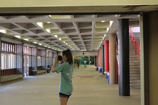
The girl taking a photo.
Yes, I do think that my subject is clear.
Simplicity
The kid reading.
Yes, I do think that my subject is clear.


Wednesday, September 14, 2016

Drop the Bass

Drop the Bass is a photo of a girl pouring paint onto a speaker, and all of the paint is splashing up with the beat of the song.

I picked this photo because I thought that it was really interesting how the paint could splash that far up with the beat of the music. And I would think that it would be really hard to capture the paint splashing.

I thought that balance was used perfectly in this photo. Even the paint that was splashing up was even on both sides.

I think that I could go to the library and some science classes to take photos like the ones that I saw today.

I would like to go to Mrs. Keyes to take photos. I feel like there will especially be a lot of photo opportunities in the library.

I will use the rules of photography to get my photos to look like the ones that I saw today. I will also make sure to get close, with not as much background space.

Best Action

This shows the best action to me because you can tell that everyone is just having the best time singing and dancing together. 

Most Interesting

This to me shows the most interesting stuff because the photographer captured people turning ordinary things into unusual things.

Story


To me this photo tells a story because you can tell that all of the girls have really bonded together over the time that they have known each other. I think that it shows that through the hardships and pain that they have gone through, they are still a team and they will always care for each other.


Friday, September 9, 2016

Mergers

I chose this as a merger photo because the men that are wearing the black suits bend in with the black background. To fix this the photographer should have moved more to the right, and had the shelf as the background.

Framing

This photo is a great photo of framing because the building is shadowed, except for the part where the subject is. Because of that, the subject really stands out and the photo focuses on him.

Balance

I said that this photo displays balance perfectly because the twin towers on the right, and the Brooklyn bridge on the left, are almost the exact same size and they are each centered in their own half.

Lines

I think that this is a great representation of lines because the flag on the flag pole has not yet reached the top of the pole, so it has room to rise. Also not only is the flag pole diagonal, but the brush in the background lines up with it.

Rule of Thirds

I said that this was the rule of thirds because the twin towers (the subject) is not centered, it is in the righthand corner. Also, there was room for the dust to fly to the left.

Simplicity


Bowie
Metal

Square

Happy


Friday, September 2, 2016

The Camera


1. The "camera obscure" effect was the first camera ever made. It was made by having a tiny hole in the wall which acted like a lens. That hole would then focus and project the light on the wall of the dark room.

2. During the 17th Century an invention called Lenses and Optics help Isaac Newton get closer to the modern camera. 

3. The first modern camera is the made of a glass lens, a dark box, and film.

4.Modern cameras and Niepce's cameras both include some of the same parts, and functions. The light passes through the lens, into the camera, and exposes the camera.

5. Digital cameras use electronic sensors called CCD's to capture an image.

6. The difference between the Auto Mode and the Program mode is that on auto mode, the camera takes complete control of the flash. In program mode you have complete control of the flash.

7. Portrait mode is used for taking portraits of people. It works by blurring out the background, and focusing up close.

8. Sports mode is used for taking photos of things moving fast without having blurry photos. It is used by using the fastest shutter mode.

9. You should do a half press on the trigger button so that you have more control. Also, the camera will have a faster response time.

10. That symbol means that there is no flash. You would use it to turn off the flash.

11. This symbol means that you are in auto flash. You would use this if you did not wan't to mess with the flash, and you wanted the camera to control it.

12. If there is too much light, then your photo will be washed out.

13. If there is too much light, then you photo will be too dark.

14. A "stop" changes the brightness of the light.

15. The new planet would be 1 stop brighter if there were 2 suns.

16. The new planet would be 2 stops brighter if there were 4 suns.

17. The longer shutter of speed would mean more light.

18. The shorter shutter of speed would have less light.

19. The aperture controls the light.

20. When adjusting the capture, you increase the amount of light by making the opening bigger. 

Great Black and White Photographers


Berenice Abbott- at Tri-Barber School (1935-1939)
Ansel Adams- The Tetons and the Snake River, at Grand Teton National Park, Wyoming (1942)
Margaret Bourke-White- at Tuktoyaktuk, Canada (1937)